Basically, we have two ways to evaluate seasonality:
Both methods have their own advantages and disadvantages. In this article, I would like to explain how to correctly evaluate seasonality with the help of seasonal patterns and how to avoid common mistakes.
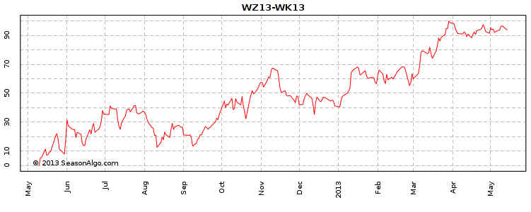
There are many algorithms that can be used for pattern calculation (differing in using absolute or relative values, some de-trend data, etc.). We choose to stick with the following algorithm:
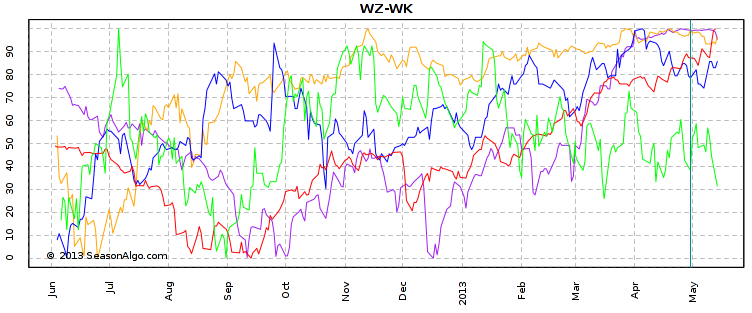
We have two options for displaying the pattern. The first one is as above – the normalized pattern. We can have more than one pattern in one chart (Analyze=>Seasonal menu, for example five and fifteen year patterns to see possible changes in pattern behavior). The second option is to display the normalized historical pattern together with the current spread in one chart (for example, see Builder chart). This can often be a source of confusion. Many people try to use the normalized pattern for profit target determination. This is an incorrect use of the pattern, as I explain below.
As we already know, pattern values are relative. We need to apply the pattern to the spread chart, which means transforming relative values back to absolute. We use the following algorithm to align the pattern to the current spread:
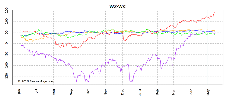
You can see an example in the chart below. Here, we see the same pattern and spread, but at different times of the year. The first chart spread ends at the beginning of October 2012 and the second chart spread ends at the begging of March 2013. What can we observe?
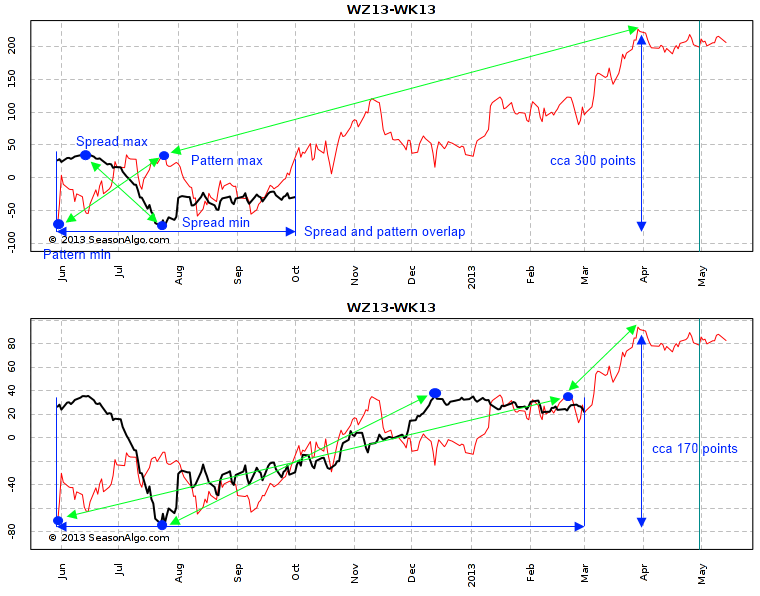
So what’s the important lesson? Always use the aligned pattern only to evaluate seasonality, never use it for profit target determination! The aligning is only artificial and doesn’t tell us anything about the real absolute values. The best way to determine profit targets and stop losses is to use back-testing and/or current and historical price levels.
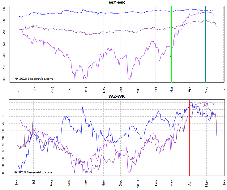
How do extreme years affect the seasonal pattern? I often hear this question along with a request to be able remove some years from the pattern calculation. Because you now know about normalization in the pattern calculation, you should be able answer this question. Let’s look at an example. We have three years - 2010, 2008, 1995 (I choose these three, because they nicely demonstrate my example) to be used in the pattern calculation. The top chart below shows all three years in absolute values. At the first sight we would come to the conclusion that the year 2008 (violet color) movement in the March seasonal window is at least ten times larger than in the other two years. And that extreme move has to affect the pattern appearance. But remember normalization! The second chart shows the normalized values and we see that the relative movements of all three years are very comparable.
In this article, I wanted to show you how a seasonal pattern is calculated and what the consequences are. Pattern to spread aligning doesn’t produce meaningful absolute values and can change every day. Never use the normalized pattern for profit target determination. And remember, because of normalization, you don’t have to worry about extreme years.
The information presented in this site is for general information purposes only. Although every effort attempt has been made to assure accuracy, we assume no responsibility for errors or omissions. Everything is provided for illustrative purposes only and should not be construed as investment advice or strategy. This site disclaims any responsibility for losses incurred for market positions taken by visitors or registered users, or for any misunderstanding on the part of any users of this website. This site shall not be liable for any indirect incidental, special or consequential damages, and in no event will this site be held liable for any of the products or services offered through this website.
The risk of loss in trading commodities can be substantial. You should therefore carefully consider whether such trading is suitable for you in light of your financial condition. The high degree of leverage that is often obtainable in commodity trading can work against you as well for you. The use of leverage can lead to large losses as well as gains. Past results are not indicative of future results. Hypothetical performance results have many inherent limitations, some of which are described below. No representation is being made that any account will or is likely to achieve profits or losses similar to those shown. In fact, there are sharp differences between hypothetical performance results and the actual results subsequently achieved by any particular trading program. One of the limitations of hypothetical performance results is that they are generally prepared with the benefit of hindsight.
© 2013, SeasonAlgo.com